
Showing posts with label Research. Show all posts
Showing posts with label Research. Show all posts
Friday, 11 February 2011


Front Cover Mock Ups

This is mock up has become the basic ground work of my finished design. Aspects from it which work well are The large mastheads and the simple cover lines. I have continued to use these in my final piece bu I have adapted them to create a better look.

This mock up did not turn out as well as the previous one. Parts of this mock up that I don't feel worked well are the to larger image and the Masthead that is to small. On my final piece to counter this I will improve the final image by resizing it appropriately and I will make the Masthead larger. Secondly I do not think the guitar works well. I drew round it to try and help align it along with the same cartoon style font I have used for my Masthead and the Rory Galvenez. Instead I managed to make the impression that I had drawn the guitar from scratch.

Points on this mock up that i like are limited to the banner that runs along the bottom; I like the colour used and the black and white image, I will try and use this in my final work. The rest of the mock up does not work well as I have used to many fonts and to many different sizes. The Cover lines are not set out in a structured manner and therefore it looks unprofessional. Lastly I do not like the Masthead design. It did not turn out as well as I had hoped, I will try and use a better design for my final piece.


The one on the left is my attempt to copy the Q magazine featuring Brandon Flowers. I like the Slanted writing and the list of artists placed on the front cover.
Monday, 7 February 2011
Front cover mock ups

As I used a almost cartoon font on this mock up I decided to draw around my artists guitar to try and mirror that cartoon effect.
Sunday, 6 February 2011
Contents page mock ups

In this contents page I think that the banner along the top worked well and I look to try and mirror it against the "Contents" which runs down the side of the page.
Mock ups: contents
 |
| Add caption |
This is my first mock up of my contents page. don't pay attention to the nasty cream colour, I suffered some photoshop issues.
Saturday, 5 February 2011


Friday, 4 February 2011
Final Photographs
These are all pictures I am considering using for my final front cover.

This image conveys the idea of what I wanted to do on my front cover; the idea that he has travelled, this is to be shown through the use of his guitar slung over shoulder. However I decided that his legs were to close together and didn't really give the idea of him walking. Secondly parts of the image have been cut out or are not within frame.


I think that this is the most effective picture that I have taken as it conveys everything I hope to in my front cover. I like the stance he is using and how the guitar is positioned. I plan to use this image and perhaps change it into black and white. To create an artistic and powerful look.
Evaluating class feedback from pitch
I designed my Magazine pitch to try and receive as much audience participation as possible so as to try and increase the feedback from the class. I used parts of my pitch to help me do this effectively. The parts of the pitch I used to help me do this was the names of my magazine.
For this I took a poll in my class of which names sounded best for my magazine and I had a strong results. The class voted for their favourite and the one which received the highest approval was AMM or Alternative Music Magazine. I took Alternative Music Magazine and I Incorporated this into the name. I took the Alternative Music Magazine (AMM) and changed it to Alternative Indie Magazine so that it spells AIM. I feel this is a change to make a name that my class liked, better.
I was apprehensive about announcing my three colour palette to my class as I didn't know how well it would be taken. I knew I as keen on it as I thought that Orange, Black and white complemented each other well but I was cautious about how the class would feel. When I did reach this part in my pitch the class liked my three colour palette and I received helpful comments. One comment was that it would appeal to the slightly older readers of the magazine, another was that it helps tie my magazine down to the slightly strange music genre; this is what I was hoping to do.
Lastly I received feedback on my targeted audience. I was told that aiming to incorporate new listeners of alternative music whilst hoping to attract an older generation of listeners; incorporating those from teenage to late twenties was striking to high and was unrealistic. I therefore decided to change target audience age to that roughly of my own age, this being 16 but still trying to reach those of early twenties. I am now hoping my magazine will appeal to the age range of 16-24. This is a much smaller gap than I had before.
Tuesday, 1 February 2011
Represntation of a social group within my magazine
Within my magazine a social group will be represented. My magazine is aimed at young adults, primarily at the age of 15-24. This group of people will have a strong knowledge of the Alternative music portrayed within my magazine and will be keen listeners of the same sort of bands/artists. They will be laid back and easy going type of people who have a broad range of music within the genre of my magazine, and will thus be able to understand why my magazine may vary heavily between certain artists and bands. For example Jack Johnson who is a singer songwriter or Frightened Rabbit who are a band of slightly weird Alternative rock. The fashion sense of my magazine isn't all out Indie and it isn't strange clothes to mirror the Alternative twist. Instead people who listen to the type of music presented will have a casual fashion sense, preferring to be laid back in some casual jeans and a hoody.

The readers may play some sort of instrument; one which fits the genre of the magazine, perhaps guitar or maybe drums. The readers will again most likely attend college or university as I believe that this it the type of audience my magazine appeal to.

Wednesday, 26 January 2011
Monday, 24 January 2011


Monday, 17 January 2011
Mock photographs for magazine front cover
I have created ideas for two magazine front covers. The first is one I have already detailed on this blog about having a procession of three photographs. The second I have developed is just a simple one photograph front cover. Similar to Esquire magazine. I think this is a good look as it is simple and easy to look at and lets the reader get straight to the point. My image for the front cover of this magazine would look similar to this.


However I have decided that if I am to use a single photograph I must have the whole of the artists body in the picture to make it work. So to improve on this mock photograph I plan to have my artists whole body in the picture and have him standing more to the side. The guitar will be further over his shoulder and will rest further down his back. Giving the impression of a travelling man's bag. This is to show that my artist has taken inspiration from his travels. My artist will also look down at the floor just in front of him so that the focus is on his face. He will have a intense gaze on his face.
Mock photographs for magazine front cover
This post shows some experimental pictures I took of people to help me start to think about camera angles I want to use with my actual model. (not the taken are not my actual models). This as helped me understand what i want to create with my model and the impression I want to put across via these pictures.


This is the style of image I'm thinking of using. There will be a progression of three to show that my artist has been up and coming. Starting with an image like this my model will face the opposite way to how he holds his guitar. The actual image I'll use will be my model against a white background with perhaps some vignetting.
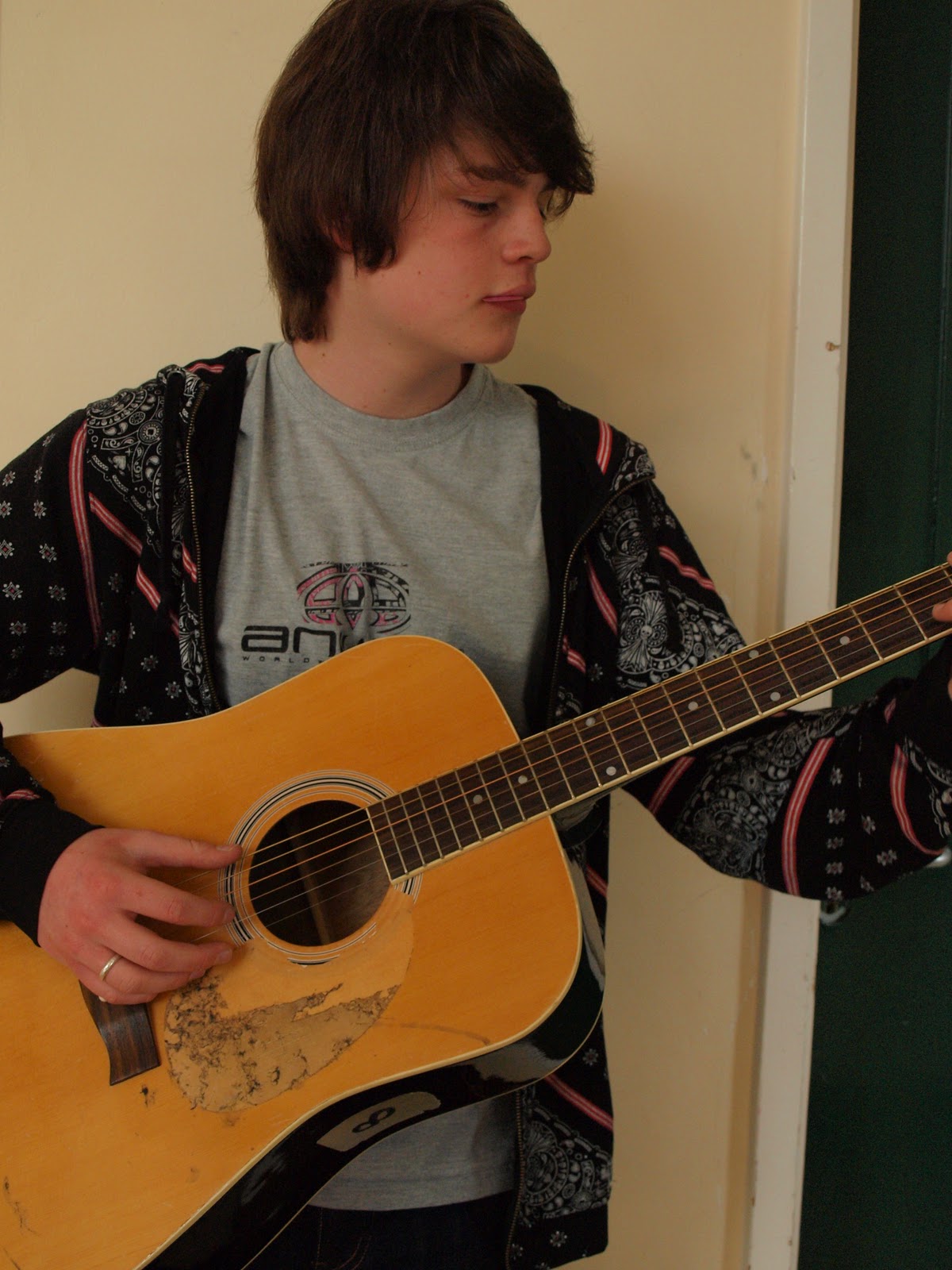
This is the next image in the group of three I'll place on my magazine front cover. Here I'll have my artist finger picking his guitar and I'll try and make emphasis on how he is finger picking. In this picture it hasn't really worked as his guitar pick is pink and it just looks like he is sticking his tongue out. In my actual image my model will stood more upright. Again I might have my artist turning his head away from the direction that the guitar neck is pointing in, just because it adds a different feel to the image.

If I decide to use the idea of a procession of three images, this will be the last. I will have him holding the guitar then finger picking the guitar and then strumming the guitar with a pick in his hand. Here I have had my artist face in the opposite direction to where his guitar neck is pointing. If I was to use this idea for my front cover I would position the images so it would look like the first and the last were looking at each other.
Friday, 14 January 2011
Fonts 2
These are some fonts and masthead designs now I've decided upon my new name. I like the type of design that looks like the actual writing has been cut out of the background so that is what I've gone for here. My favourite and the one I've decided to use is the one with the white background and black writing for the AIM part. I decided upon this in my head whilst drawing my magazine mock up but included other designs as well to make sure I had a selection just in case my chosen masthead didn't look good in reality.
These are some fonts and masthead designs now I've decided upon my new name. I like the type of design that looks like the actual writing has been cut out of the background so that is what I've gone for here. My favourite and the one I've decided to use is the one with the white background and black writing for the AIM part. I decided upon this in my head whilst drawing my magazine mock up but included other designs as well to make sure I had a selection just in case my chosen masthead didn't look good in reality.
Thursday, 13 January 2011
My contents and double page spread
For my magazine I have decided that a simplistic view, commonly used by magazines like Esquire is the best one to take. This is because it doesn't give the reader to much to look at and can allow them to go straight to the point. This is why I have decided that for my front cover, my contents page and my double page spread I will have a single person on each page. On the front cover there will either be a series of pictures of the one artist or a solo picture of the artist, similar to the front covers on Esquire magazines. Both the pictures will be accompanied by cover lines.
On my contents page I will have my main image placed in an unusual fashion. To make sure that the reader will be interested in it. Around this image, in vertical columns I will then place the contents of my magazine. Instead of having a different image of the same person as on my front cover I am going to photograph a different artist for my contents page. As I will have used a boy on my front cover I will use a girl for my contents.
My double page spread will again have only one image but I will have it take up a whole page. Then I will have my writing in two or three columns on the other side of the image. Making it easy for the reader to relate the article back to the image. My front cover artist will be the feature of my double page spread.
Artist profile
Name: Rory Galvenez
Age: 21
British singer songwriter, alternative style.
First time singer song writer who has become big in alternative music after very successful debut album. Double page spread is an interview with the artist to see where he came up with the idea for his album.
Questions that can be asked in double page interview:
My artist will be dressed in mainly indie clothes. But they will still be casual so I will not have him going full indie to tie into my alternative side. His outfit will consist mainly of skinny jeans, boots and some sort of casual top and possibly a coat of the same indie fashion. My artist is tall.
Rory, has always known the south, and the sea. Growing up on the south coast of England he has been exposed to sea, salt and sand since an early age. However Rory isn't such a keen surfer as more of the guy who likes to lie on the beach and write songs. As a teenager, he worked in a small beach shop come cafe on the Fistral beach front. He tried his hand at surfing and at evening surf sessions he became used to hearing the slow melodious tunes of Jack Johnson drifting across the sands. He picked up his first guitar at the age of 15 and has never put it down. Discovering his was a dab hand at guitar he spent most of his summer sitting outside his cafe and playing a mixture of Jack Johnson tunes and his own acoustic work. When he turned sixteen he was introduced to festivals and travelled a number of folk acoustic festivals in the south of England. Enjoying such exposure he left his sixth form school and travelled to a music college where he developed the skills he needed, perfecting his singing voice. He moved on from his old battered acoustic and brought a Freshman dreadnought body. Enjoying this new sound he became determined to move onto the small stages of his idyllic festival; Glastonbury. On the 9th of May his seventeenth birthday arrived and he was delighted to discover a fender telecaster awaiting him from his parents. It had been a big ask for such an expensive present, seeing as his dad owned the local chippy and his mum worked in a play group. Ever grateful he spent three weeks developing a song to honour his parents. He played his way through the rest of the year; playing "pubs and clubs" in the centre of Newquay. As soon as he could he took a gap year, after saving solidly from his small cafe job and beach busking he had acquired the funds for his travelling adventure. He busked his away across Europe and finally got the funds for his trip to AAustralia and New Zealand. He became the centre of any youth hostel he travelled to and he would play the night away on an old battered acoustic whilst he shared beers with new friends. He became increasingly apt at the ukulele, enjoying the new tunes he could hit. After a year away he returned to start his university career. He had decided it was time to leave the south and he travelled north; studying music and film making at Edinburgh. despite his travelling and exposure to the world he fell on hard times at university. with the death of his mum he almost failed his first year and only just scraped through. He pulled through and at the age of 21 he realised his dream as he was signed by brushfire records, Jack Johnsons own record label. He says he must have been heard whilst travelling Hawaii. Now he has released his debut album and here he is.
Age: 21
British singer songwriter, alternative style.
First time singer song writer who has become big in alternative music after very successful debut album. Double page spread is an interview with the artist to see where he came up with the idea for his album.
Questions that can be asked in double page interview:
- Where his inspiration came from for his first album and many of his songs
- Whether he drew inspiration from other indie alternative artists and what type of music he was into.
- His early life and what effect that had on him
- How he spent his early life.
- His plans for his next album.
- Whether he'll tour or not?
- How is he different from the other artists?
- What type of guitars he plays.
My artist will be dressed in mainly indie clothes. But they will still be casual so I will not have him going full indie to tie into my alternative side. His outfit will consist mainly of skinny jeans, boots and some sort of casual top and possibly a coat of the same indie fashion. My artist is tall.
Rory, has always known the south, and the sea. Growing up on the south coast of England he has been exposed to sea, salt and sand since an early age. However Rory isn't such a keen surfer as more of the guy who likes to lie on the beach and write songs. As a teenager, he worked in a small beach shop come cafe on the Fistral beach front. He tried his hand at surfing and at evening surf sessions he became used to hearing the slow melodious tunes of Jack Johnson drifting across the sands. He picked up his first guitar at the age of 15 and has never put it down. Discovering his was a dab hand at guitar he spent most of his summer sitting outside his cafe and playing a mixture of Jack Johnson tunes and his own acoustic work. When he turned sixteen he was introduced to festivals and travelled a number of folk acoustic festivals in the south of England. Enjoying such exposure he left his sixth form school and travelled to a music college where he developed the skills he needed, perfecting his singing voice. He moved on from his old battered acoustic and brought a Freshman dreadnought body. Enjoying this new sound he became determined to move onto the small stages of his idyllic festival; Glastonbury. On the 9th of May his seventeenth birthday arrived and he was delighted to discover a fender telecaster awaiting him from his parents. It had been a big ask for such an expensive present, seeing as his dad owned the local chippy and his mum worked in a play group. Ever grateful he spent three weeks developing a song to honour his parents. He played his way through the rest of the year; playing "pubs and clubs" in the centre of Newquay. As soon as he could he took a gap year, after saving solidly from his small cafe job and beach busking he had acquired the funds for his travelling adventure. He busked his away across Europe and finally got the funds for his trip to AAustralia and New Zealand. He became the centre of any youth hostel he travelled to and he would play the night away on an old battered acoustic whilst he shared beers with new friends. He became increasingly apt at the ukulele, enjoying the new tunes he could hit. After a year away he returned to start his university career. He had decided it was time to leave the south and he travelled north; studying music and film making at Edinburgh. despite his travelling and exposure to the world he fell on hard times at university. with the death of his mum he almost failed his first year and only just scraped through. He pulled through and at the age of 21 he realised his dream as he was signed by brushfire records, Jack Johnsons own record label. He says he must have been heard whilst travelling Hawaii. Now he has released his debut album and here he is.
Subscribe to:
Posts (Atom)