These are all pictures I am considering using for my final front cover.
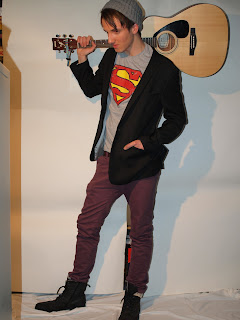
This image conveys the idea of what I wanted to do on my front cover; the idea that he has travelled, this is to be shown through the use of his guitar slung over shoulder. However I decided that his legs were to close together and didn't really give the idea of him walking. Secondly parts of the image have been cut out or are not within frame.
This image works well as it incorporates the idea of him walking; his legs are open. Secondly he is smiling and I think that this is good as it gives the character a personality. However his posture is on a slant and i f I cut him out to place him on my front cover it might look strange and not work as effectively as hoped.I also like this image. It is not dynamic as the other to are in the idea that he is travelling, however it shows him playing a chord on his guitar. I also like how he is turning his head. However I do not think it will work as because he is crouching the image is quite compact and I think that it will look out of proportion when stretched to touch the Masthead, as is custom in magazines.
This image works better than the last in the idea that he is not crouching and therefore he would be able to touch the Masthead easily. However it differs from the idea that I would like to portray. One that he is travelling. Although I like the stance that is being pulled and how he is looking the opposite way than to his guitar. However and Rather unfortunately he is pulling a rather sinister face, not the appearance I am looking for on my magazine.
I think that this is the most effective picture that I have taken as it conveys everything I hope to in my front cover. I like the stance he is using and how the guitar is positioned. I plan to use this image and perhaps change it into black and white. To create an artistic and powerful look.


No comments:
Post a Comment